
Website transformation
A national energy client launched a customer-first website transformation to deliver a seamless, intuitive, and emotionally resonant digital experience that redefines what it means to serve as a modern utility.
A national energy provider faced mounting pressure to modernize its digital presence. Its website, last redesigned in 2019, had become outdated—burdened by content sprawl, inconsistent navigation, and a lack of personalization. Customers struggled to complete essential tasks like paying bills or reporting outages, and internal teams cited the need for a more agile, scalable platform that could evolve with shifting expectations. The organization sought to redefine its digital identity—not just as a utility, but as a trusted, community-focused partner.
Challenges
Strategy Phase
The transformation began with a seven-week experience strategy engagement that included:
Customer & Stakeholder Research: Over 1,600 customer survey responses and interviews with internal stakeholders revealed key usability pain points and opportunities for improvement.
Persona & Journey Mapping: Four personas were developed to represent core user mindsets, each aligned to critical “Moments That Matter” such as starting service, paying bills, or restoring power.
Strategic Pillars: The team defined three guiding principles—transactional simplicity, personalized and predictive experiences, and a brand identity that goes beyond utility
Approach


Concepting Phase
The concepting phase translated strategic insights into a creative direction:
Mood Board Development: The team introduced “The Confidant,” a concept that embodied warmth, trust, and clarity—evoking the feeling of a reliable partner anticipating user needs.
Design Themes:
Mobile-first experience
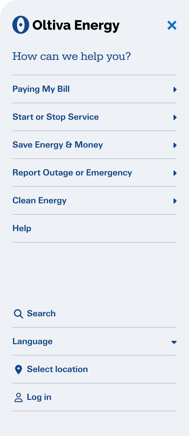
Streamlined navigation (e.g., mega menu for desktop, hamburger for mobile)
Expanded color palette and refined typography
Emphasis on empathy, community connection, and brand storytelling
Feedback Integration: Stakeholder feedback led to refinements such as reducing story content, toning down color usage, and removing unnecessary visual elements
Design & Usability Testing
Template Design: A comprehensive set of page templates was created to support key user journeys, including homepage, landing pages, FAQs, and transactional flows.
Design System: A robust design system was developed with over 40 reusable components, ensuring consistency across mobile and desktop breakpoints.
Mobile-First Approach: All designs prioritized mobile usability, with responsive behavior scaling up to desktop to ensure accessibility and performance across devices
usability testing: Three rounds of usability testing were conducted to validate design decisions and gather actionable feedback:
Methods: Included pre/post-review questions, A/B testing, mobile evaluations, and feedback from customer panels.

The redesigned website has launched, with expected outcomes including:
A streamlined, intuitive user experience across devices
A scalable design system with reusable components for future growth
Improved content governance and SEO performance
A roadmap extending into 2027, including personalization, AI integration, and continuous optimization based on user feedback